


E-commerce
Oatly
Anti-design carried off with enormous discipline: hand-drawn lettering, long copy where nobody would put it, and a tone of voice that is half the design. It works because the grid and the colour underneath are perfectly controlled.
Anti-designHandwrittenVoiceColor
oatly.com Desktop
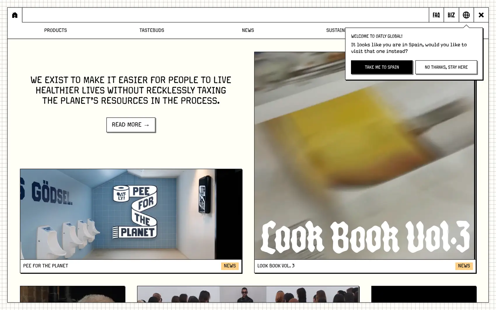

Screenshots of the real site. Scroll inside each frame to go through it.
The feeling
A milk carton that talks back: cheeky, handmade and funny.
Design system Extracted from the site
Colors
Background
#fffef6
Text
#000000
Accent
#fbcccc
Surface
#000000
Border
#000000
Palette: #fbcccc #fffef6 #000000 #98c5d3 #fdcf85
Typography
Margo Pro Regular Headlines
Scale 32px27px15px
Weights: 400 · 500 · 700
Spacing, borders and layout
- Spacing scale
- 8 · 12 · 16 · 20 · 24 · 32 px
- Base unit
- 4px
- Radii
- Pill
- Border
- 1px #000000
Third-party style reference. AIGiner is not affiliated with or sponsored by Oatly; the brand, design and content belong to their owners. Shown for illustrative purposes. Are you the owner and would rather we remove it? Write to us.
Similar pages
See all
We design websites at this level
Tell us about your brand, launch or event and we'll propose a creative website with this attention to detail and this finish.