


Portfolio / Studio
By-Kin
A British studio of assured editorial typography: enormous serif headlines, a classic magazine grid and the smoothest page-to-page transitions. It won four awards in one year for doing the hard thing, which is looking simple.
EditorialSerifTransitionsStrict grid
by-kin.com Desktop
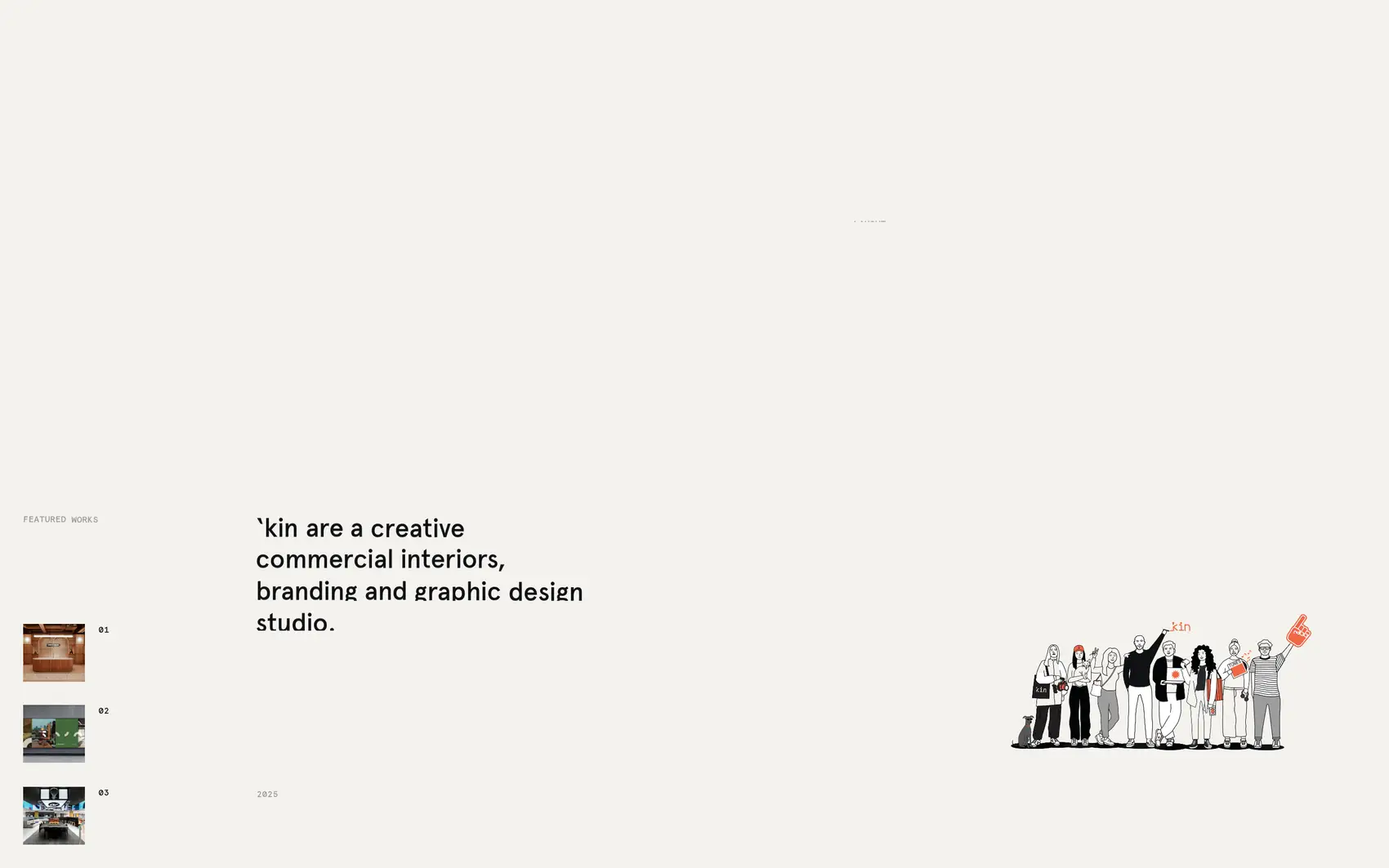
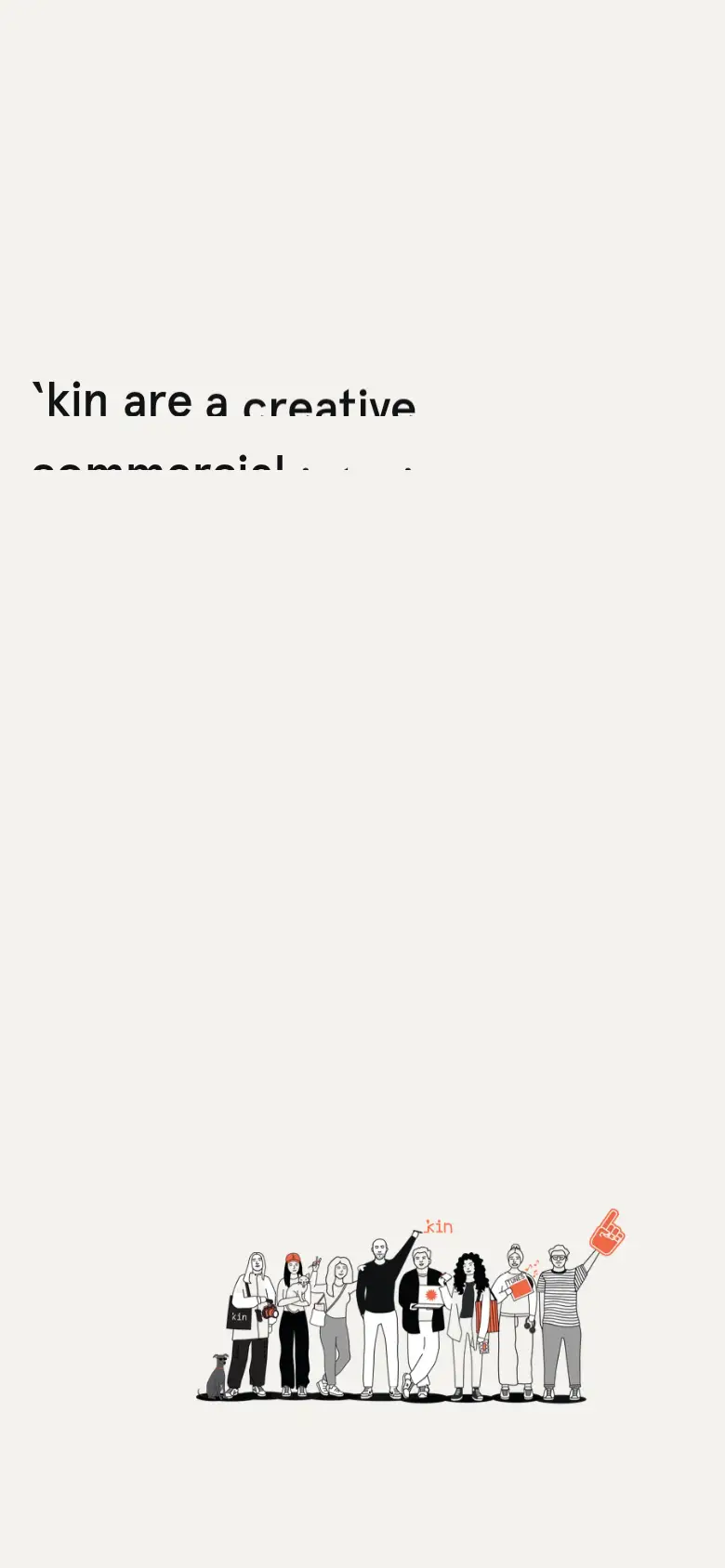
Screenshots of the real site. Scroll inside each frame to go through it.
The feeling
An architecture magazine: literate, calm and confident.
Design system Extracted from the site
Colors
Background
#f4f2ed
Text
#111214
Accent
#f4f2ed
Palette: #f4f2ed #ffffff #111214 #000000 #d0d0d0 #989898
Typography
Apercu Pro Headlines
Scale 50px9px
Weights: 500
Spacing, borders and layout
- Spacing scale
- 4 · 20 px
- Base unit
- 4px
- Border
- 1px
Third-party style reference. AIGiner is not affiliated with or sponsored by By-Kin; the brand, design and content belong to their owners. Shown for illustrative purposes. Are you the owner and would rather we remove it? Write to us.
Similar pages
See all

We design websites at this level
Tell us about your brand, launch or event and we'll propose a creative website with this attention to detail and this finish.