


Wise
Wise turns a complex financial product into a bright, easygoing experience: huge headlines in its own typeface, vibrant illustrations and a crystal-clear hierarchy that guides the read effortlessly. The detail is in how it balances saturated color and negative space so complex information feels approachable.





Screenshots of the real site. Scroll inside each frame to go through it.
Bright, warm optimism, with international energy and financial confidence.
Colors
Typography
Weights: 600 · 900
Spacing, borders and layout
- Spacing scale
- 4 · 8 · 12 · 16 px
- Base unit
- 4px
- Radii
- Pill · 2px · 19px · 50px
- Border
- 1px #9fe870
- Content width
- 1440px
Third-party style reference. AIGiner is not affiliated with or sponsored by Wise; the brand, design and content belong to their owners. Shown for illustrative purposes. Are you the owner and would rather we remove it? Write to us.
Similar pages
See all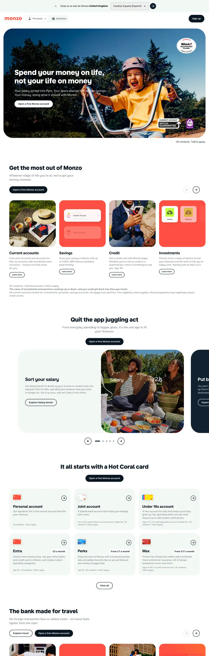

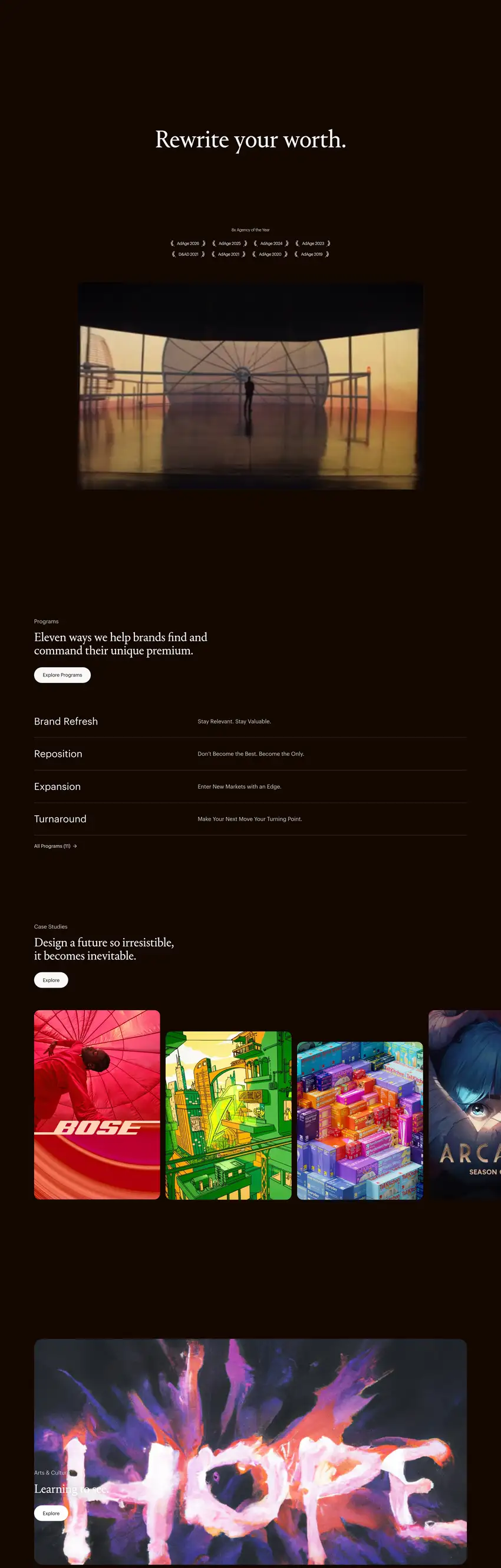
We design websites at this level
Tell us about your brand, launch or event and we'll propose a creative website with this attention to detail and this finish.