


Pentagram
Pentagram commits to a relentless editorial grid where the work leads: full-bleed thumbnails, large neo-grotesque typography and a crisp hierarchy that lets every project breathe. The detail is in the restraint: thin borders, sober transitions and a use of color that comes from the images themselves, not the interface.






Screenshots of the real site. Scroll inside each frame to go through it.
Calm editorial authority: typographic confidence, black and white, and the work taking absolute center stage.
Colors
Typography
Weights: 400 · 500
Spacing, borders and layout
- Spacing scale
- 4 · 8 · 12 · 16 · 24 · 32 px
- Base unit
- 4px
- Radii
- 4px · Pill · 8px
- Border
- 1px #333333
- Content width
- 1728px
Third-party style reference. AIGiner is not affiliated with or sponsored by Pentagram; the brand, design and content belong to their owners. Shown for illustrative purposes. Are you the owner and would rather we remove it? Write to us.
Similar pages
See all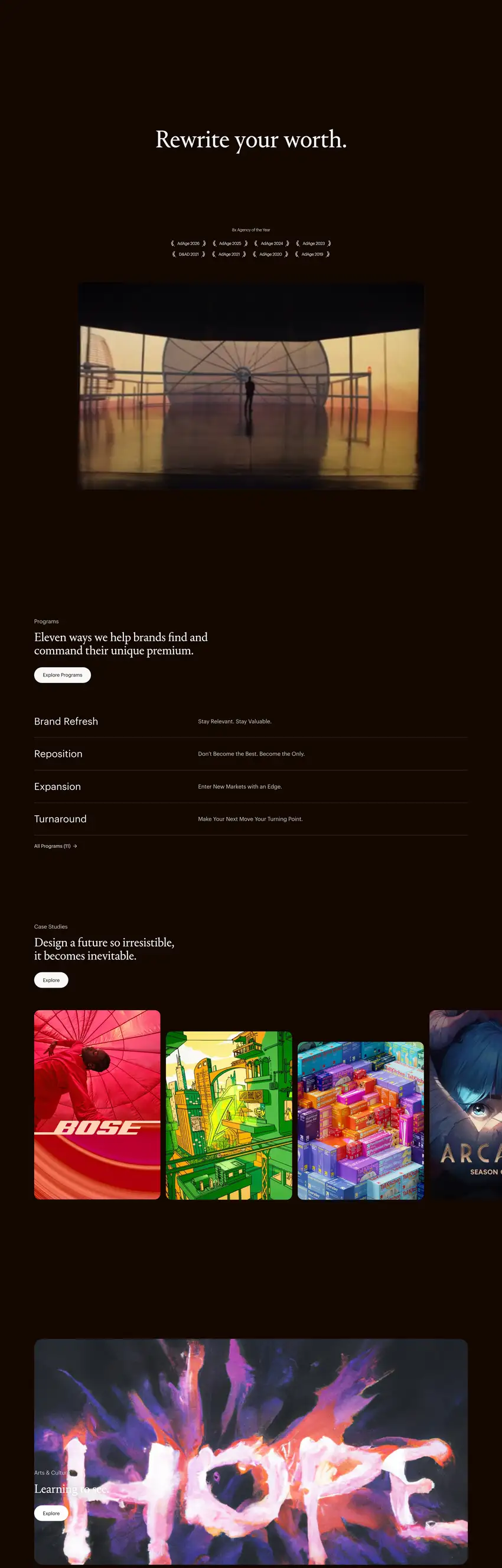
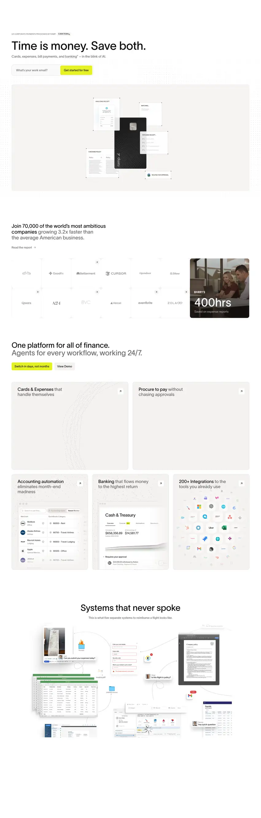
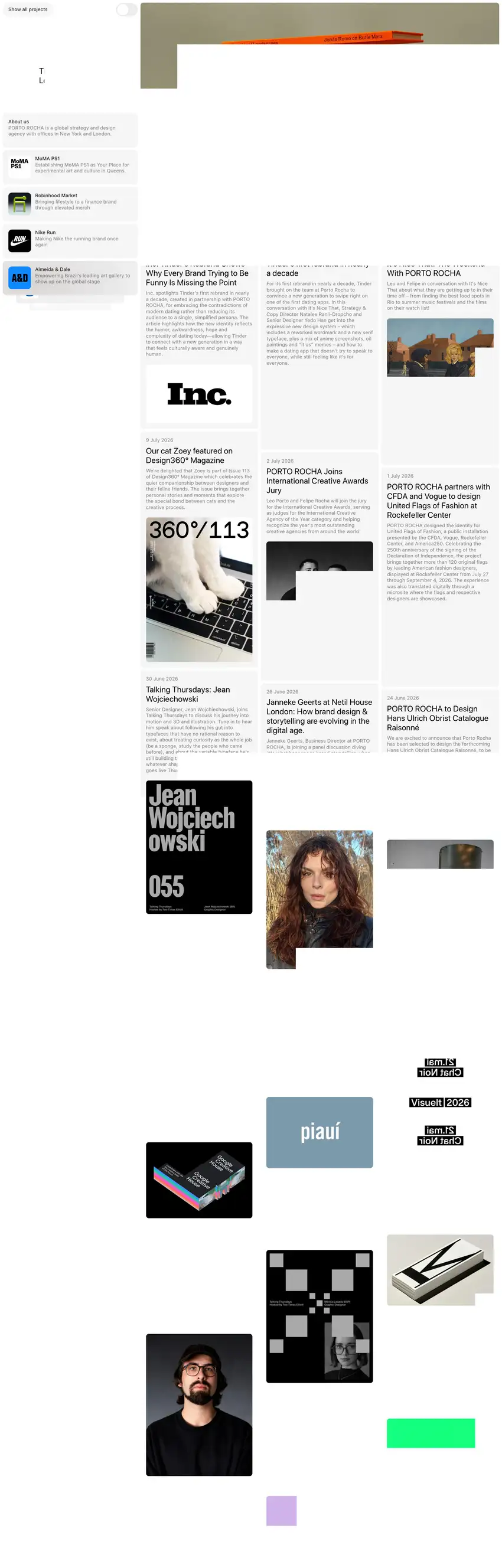
We design websites at this level
Tell us about your brand, launch or event and we'll propose a creative website with this attention to detail and this finish.