

Locomotive
A studio portfolio that pairs a high-contrast editorial serif with a neutral grotesque, over wide compositions and buttery-smooth scroll animations (their own smooth-scroll library) that turn navigation into a cinematic experience. The hierarchy is immaculate, and typographic detail is the main character.
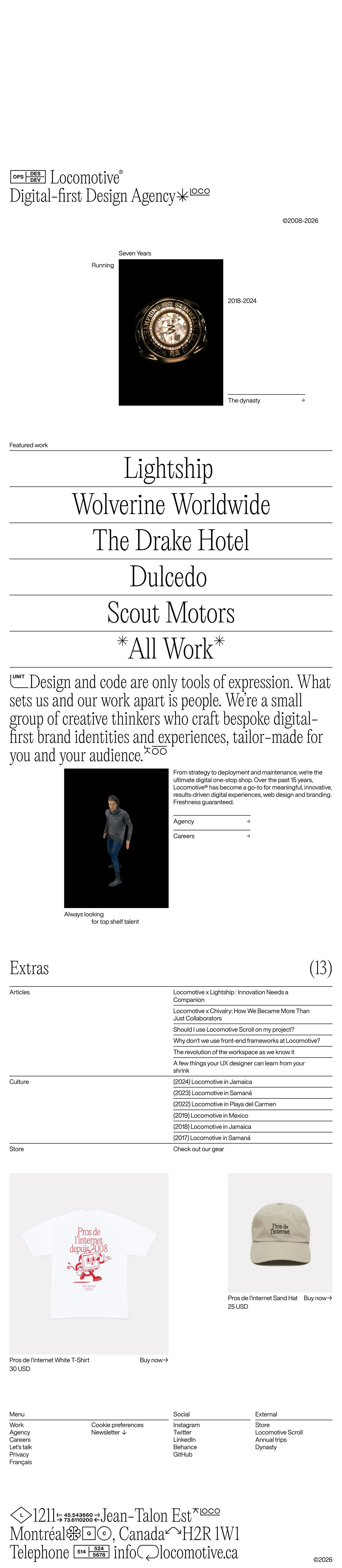

Screenshots of the real site. Scroll inside each frame to go through it.
Editorial sophistication and digital craft, with a touch of bold elegance.
Colors
Typography
Weights: 400
Spacing, borders and layout
- Spacing scale
- 4 · 8 · 12 · 16 · 20 px
- Base unit
- 4px
- Border
- 2px #000000
Third-party style reference. AIGiner is not affiliated with or sponsored by Locomotive; the brand, design and content belong to their owners. Shown for illustrative purposes. Are you the owner and would rather we remove it? Write to us.
Similar pages
See all
We design websites at this level
Tell us about your brand, launch or event and we'll propose a creative website with this attention to detail and this finish.